Uncovering the Top 8 Data Visualization Trends: Use Data Visualization to Your Advantage
Content Map
More chaptersIndustries have been looking for ways to enhance the assurance of their data-driven decisions, and one of the most effective solutions has been data visualization. Over the years, data visualization has evolved from simple, uninteresting graphs to the captivating and visually appealing visuals we have come to know today. However, this raises the question of how and when to take advantage of the vast resources available online for data visualization. Additionally, what are the current data visualization trends? This article aims to seek answers to these questions while also providing readers with the most up-to-date trends that are expected to remain in place in 2023 and beyond.
Why Is Data Visualization Important?

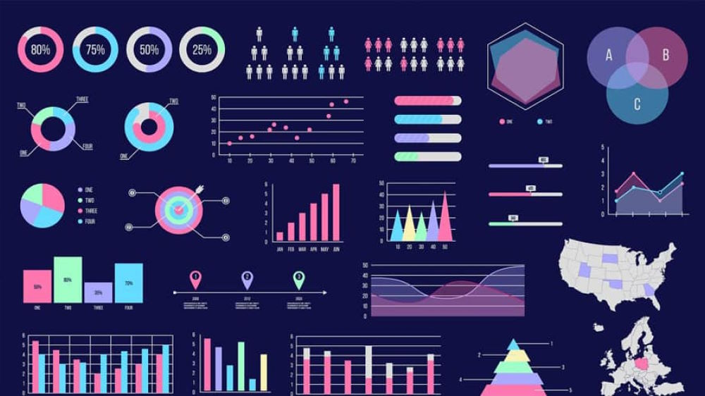
Data visualization refers to the use of common visual representations of data, namely graphs, charts, infographics, and animation. These visual representations of data convey complex relationships and insights in an easily digestible manner.
Harvard Business Review has stated four main purposes of data visualization: Idea generation, idea illustration, visual discovery, and everyday dataviz.
Data visualization is used in numerous industries like data science, sales, logistics, finance, and so on. It plays an important role for the following reasons:
- Data visualization is a quick and efficient way of communicating information. It takes raw data, models it, and delivers data in visual forms like infographics, heatmaps, or histograms for a strong visual impact, allowing viewers to quickly pinpoint trends and patterns, which aspects need more attention, or how to place specific products.
- The captivating visuals maintain the audience’s interest longer. Data visualizations also encourage the users to analyze and quickly act on findings.
- The concepts illustrated in data visualizations are conveyed quickly. Thus, a variety of scenarios can be explored even when you don’t have a team of data scientists by your side. Leaders and managers will be able to make more confident decisions based on the information provided.
Use Cases for Data Visualization
Data visualization is accessible, memorable, and easy to understand. You can use data visualization in a wide variety of situations. Still, in many cases, it gets confusing. Therefore, to make the most out of data visualization, consider using it when you need to:
Look for Correlation
Data visualization tools are great for determining relationships. It is always crucial to be aware of the relationship between multiple variables, and sometimes, pure text simply doesn’t reveal them.
Figure out Frequency
This is one of the simplest uses of data visualization. When time-sensitive data is an important factor, data visualization helps examine how events unfold and evolve with time.
Recognize Trends and Peaks
Operators and staff can correctly assess the effectiveness of specific campaigns or new features by identifying trends or patterns in the collected data that can offer actionable insights.
Combine Various Data Sets
Data visualization is an excellent choice if you need to gather complex data from various sources and compare values over a specific period of time.
Data Visualization Trends
Data visualization in itself is considered one of the prevailing trends in data analytics and big data. When we take a closer look at data visualization alone, there are eight notable trends that are likely to expand in importance in 2023 and even years after.
Real-Time Data Visualization and Analysis
It only makes sense that real-time visualization and analysis is an important data visualization trend. It allows businesses to stay up-to-date (which is crucial in today’s business landscape) so they can make quick but informed decisions. Real-time data also alerts users of any threats so actions can quickly be taken to mitigate risk. This kind of data is already powerful on its own, but it can also be combined with historical data should you need to make strategic decisions.
Real-time visualization is widely used in IoT devices, logistics, transportation, and network ops. Real-time dashboards provide companies with valuable information like the locations and expected delivery time to monitor business activities or make necessary changes. The majority of the general public has also become used to real-time data visualization, e.g., when they need to track a food delivery order or update the delivery date of an Amazon order.
Data Democratization
Data democratization refers to the fact that data is accessible to anyone, regardless of their level of education or experience. It also means that there are no “data gatekeepers” that act as barriers to entry.
In short, you no longer need to have a whole team of data scientists or coding skills to have access to data and make them make sense. There are numerous data visualization tools for you to choose from. With simple drag-and-drop, you can easily craft your own interactive dashboard, derive information, and make strategic information from it. The democratization of data can be achieved through the use of the appropriate data visualization tool combined with predictive analysis. This opens up a vast ocean of data that can be used to inform informed business decisions.
Animated and Interactive Visualizations
Static data visualization is no longer sufficient. Interactive data visualization is what many business users prefer due to their attractive advantages.
- Animated and interactive visualizations quickly communicate the change of data over time to its viewers. It is also a great way to drill down data highlights.
- Data visualization software allows users to perform tasks including filtering different variables, customizing views, 3D zooming, offset, and delay information.
- This is a great tool for telling data stories and illustrating crucial points without the need for excessive text.
An example of this visualization method is interactive maps. The user moves the mouse to certain geographical areas and clicks on them to learn more about the location’s history, population, and economy, and even filter out the variables as they wish.
Data Visualization Content on Social Media
It is estimated that there are around 4.89 billion social media users worldwide. This massive number has proven that social-media-friendly and mobile-friendly data visualizations are the newest trends.
Data visualization shouldn’t be used solely for in-house team members to share insights, but it should also be used for customer-related activities. Presenting data in engaging data visualizations like gifs, short videos, or animations sparks engagement. The mountain of content on social media is huge; therefore, captivating visualizations with bold headlines are one effective way to stand out and have users stop scrolling.
Another great benefit of social data visualization on social media is the potential large reach that gains new customers, meaningful customer feedback, and even customer loyalty.
Data Storytelling
There are numerous data visualization techniques, but the one that is expected to become the most widespread in 2025 is data storytelling.
That’s right, dry data has the ability to tell its audience compelling stories. After all, as human beings, we are naturally drawn and more attached when it comes to emotional and meaningful stories. People tend to memorize data better this way, too. Videos and infographics always have more impact on its viewers. Data storytelling is a daunting task, nonetheless, as data visualizers first need to understand the data well enough before crafting impressive stories from them and presenting effective data visualizations.
Some companies have even built in-house teams whose main mission is to craft stories from dry data.
Artificial Intelligence and Machine Learning Data Visualization
Artificial Intelligence and machine learning (briefly known as AI and ML) are emerging technologies that are expected to cause a lot of disruptions in the future. Despite these facts, AI and ML are still considered trendsetters in numerous sectors, and data visualization is one of them.
Daily data is generated from various sources, e.g., streaming data, ERP, CRMs, etc. Most of the data is also unstructured data, which means they need to be formatted and analyzed to gain meaningful insights. It is impossible for a team to process every bit of data produced. Even if they manage to do so, it is more than likely that the process is error-prone.
AI and ML, however, have the ability to process large amounts of data quickly and precisely. They make data scientists’ jobs easier by reducing the workload and automating many of the processes. Additionally, AI and ML have the ability to analyze data with context or in regard to a specific user using visual analytics techniques. Data visualizations produced by AI and ML provide valuable insights that are likely overlooked should they be performed manually.
Mobile-Friendly Visualizations
In 2023, mobile phones will account for 54.4% of all global traffic. Mobile devices have become indispensable for many, as they are the tools people use to access apps, websites, reports, and emails for work and entertainment.
One of the most effective ways to enhance the visualization of data through mobile applications is to create mobile applications that can be implemented across multiple platforms. This allows for mobile data visualizations to be displayed on a wider range of platforms than just social media posts, thereby enhancing the user experience and increasing customer retention. It is important to note, however, that data visualization must be clear and appealing. It is not only to catch user’s attention (users’ attention span on mobile devices is relatively short) but also helps facilitate streamlined processes and more informed choices.
Augmented and Virtual Reality for Enhanced Data Immersion
Augmented and/or virtual reality (AR/VR) isn’t a new concept, but it’s gained traction recently with the release of Apple’s Vision Pro, a new generation of VR/AR headsets. This technology has great potential for the future of data visualization since it can produce immersive experiences that let people engage directly with the data. Imagine manipulating and filtering business data in real-time as you walk through your office building.
Stay On Top of the Trends
Data visualization tools play an increasingly vital role not only in the business landscape but also in our everyday lives. It provides business users with innovative methods to quickly communicate findings and actionable insights, eventually maintaining and cultivating good relationships with existing or potential customers. As the saying goes, knowledge is power. Developing a comprehensive understanding of data visualization will enable you to analyze data more effectively and develop effective strategies.

Quynh Pham
Writer
Quynh Pham
Writer
Topic: